Multi-select box UI ramble
OBIEE quiteness
April 19, 2010OBIEE – state of the market – rates
May 3, 2010[ad#banner]
Good morning.
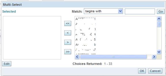
Today I want to discuss the multi-select prompt below. You should recognize this one easily – since most of you work with this quite frequently. Ta-da:
What’s wrong with it, can you ask me?
Well, the major one – I and many of the clients complained about when I worked for them – believe that it’s counter-intuitive to drag from right to the left. At least in Western culture (USA, Europe, Latin America), it’s been accepted that information is read from left to right. I won’t get into much details, but in most software that I use on a daily basis, such functionality works the other way than implemented in OBIEE – you drag from left to right. This is the biggest issue, which I hope Oracle’s developers would fix in 11g (if they don’t, I know it’s not their fault).
Second problem, you need to click Go button in order to get results. In this age of web 2.0, AJAX, etc. – it would be relatively easy to start outputting results once you start typing. I agree, this isn’t a bug per se, rather an interface issues. However, users now need to spend more time in the multi-select – instead of going straight to the data.
Third issue, 1-column positioning of data in the select window. There’s so much white space, that it could be spent better. I don’t think quality software should leave doubts in its user interface. There’s no doubt that it’s not a show stopper, but again, those little things might attribute to better acceptance by potential clients.
Finally, OK and cancel buttons should be positioned in the center. I’m not claiming to be a design and usability expert, but I observed people spending time trying to figure out what to do next, or worse, clicking on Cancel – subconsciously.
OBIEE’s Multi-select has been a source of frustration, anger, and complains from my users.
I always addressed this as a training issue, and I still hope for a fix.
P.S. while writing this I thought – “Is it possible to re-work the box?”…technically, that shouldn’t be difficult – script responsible for it is here: res/b_mozilla/prompts/gfpmultiselect.js By some java-script re-arranging – it should be possible to “reverse” boxes. Problem with that is it would constitute a major code change and loss of Oracle support, and possibly infringing on the license.
Just by looking at script – it seems as nothing have changed since 2002. Also, it would be nice to have a feature of designing own UI (such as using skins, templates, radio-buttons, other interface elements).


2 Comments
One more point about multi select, take a look at the UI that pop up when you have date/time. It’s from SA 7.X era… OBIEE team should revisit this too…
Ganesh, I agree with you. Faster JS window would be beneficial.